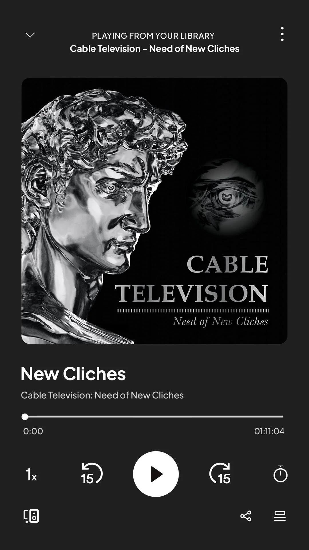
Spotify Album Cover
Case Study
The Cable Television podcast album cover explores the influence of podcast album cover design and how the visual elements affect listener engagement.
The title, subtitle, and background image were all selected at random. The goal of this project was to create an album cover from randomly selected visuals that would catch the attention of listeners and convey the genre of the podcast to viewers.
This project initially featured only the first album cover (left image). The second cover (right image) was created during the final polishing phase. The last step involved placing the podcast covers onto mockups for a professional presentation.
Exploration:
Whether or not the main title should be in all caps
Where the image should land?
If the image could be used more than once
If the font should be serif or san-serif
Findings:
Having the main title in all caps allows for more emphasis
Using repetition of imagery allows for cohesiveness, and the unity engages viewers
Multiple variations of image layout would be more effective for a multi-episode series
A serif font helps the album cover have a more traditional feel
Some final adjustments made to make the album cover more effective included ensuring the subtitle was properly capitalized, brightening the gradient on the text and the underlines, and ensuring the file was in the correct format so the album covers didn’t appear off-color or pixelated.
Final Decisions:
Credits to:
Spotify Podcast Mockup by: DhawalChandra
https://dhawalchandra.gumroad.com/
Image used in the Album Podcast Cover design by SIMON LEE on Unsplash
Photo by <a href="https://unsplash.com/@simonppt?utm_content=creditCopyText&utm_medium=referral&utm_source=unsplash">SIMON LEE</a> on <a href="https://unsplash.com/photos/a-sculpture-of-a-person-with-a-large-head-of-hair-I9wXip-cqvA?utm_content=creditCopyText&utm_medium=referral&utm_source=unsplash">Unsplash</a>


